Studio McGee's Most Commonly Used White Paint Colors
All of Shea's favorite shades in one place.
26 February –
Studio McGee’s Most Commonly Used White Paint Colors
Contents
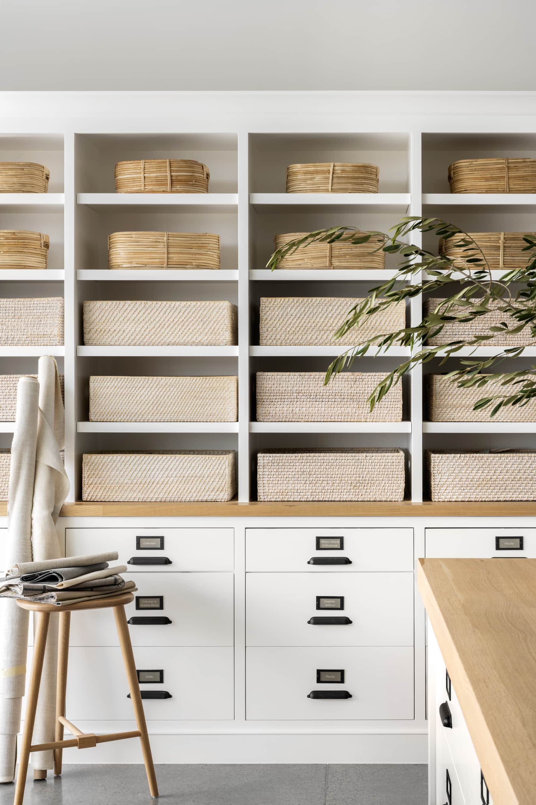
Part of Studio McGee’s signature aesthetic is the use of a neutral palette with various shades of white and cream. But as we know, not all white paints are created equal. Here are a few favorites that Shea and the design team have gone back to again and again.
When it comes to paint, there are so many options in undertones, finishes, and tones, and each can make a major impact on the end result. Here at Studio McGee one of the most common questions we get asked is, “What is that paint color?” To answer, we’ve gathered some of the most commonly used white paint colors that Shea and the design team use, even the one Shea used extensively throughout her own house.
After years of swatching, we’ve narrowed it down to four white paint colors that suit the Studio McGee aesthetic. Here’s all the inspiration you need for a perfect creamy white palette in your own home.

01
Swiss Coffee
An essential white by Benjamin Moore.
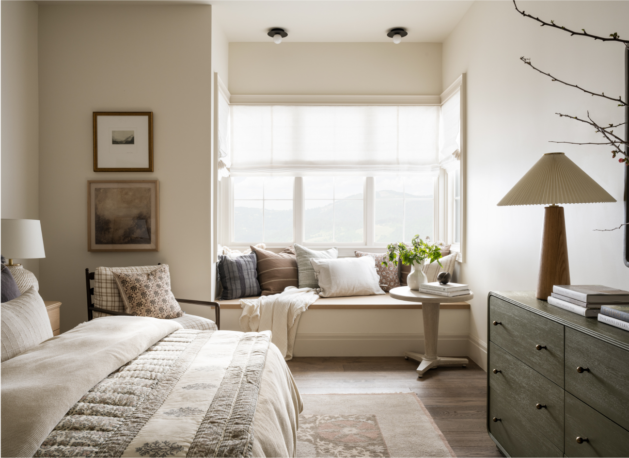
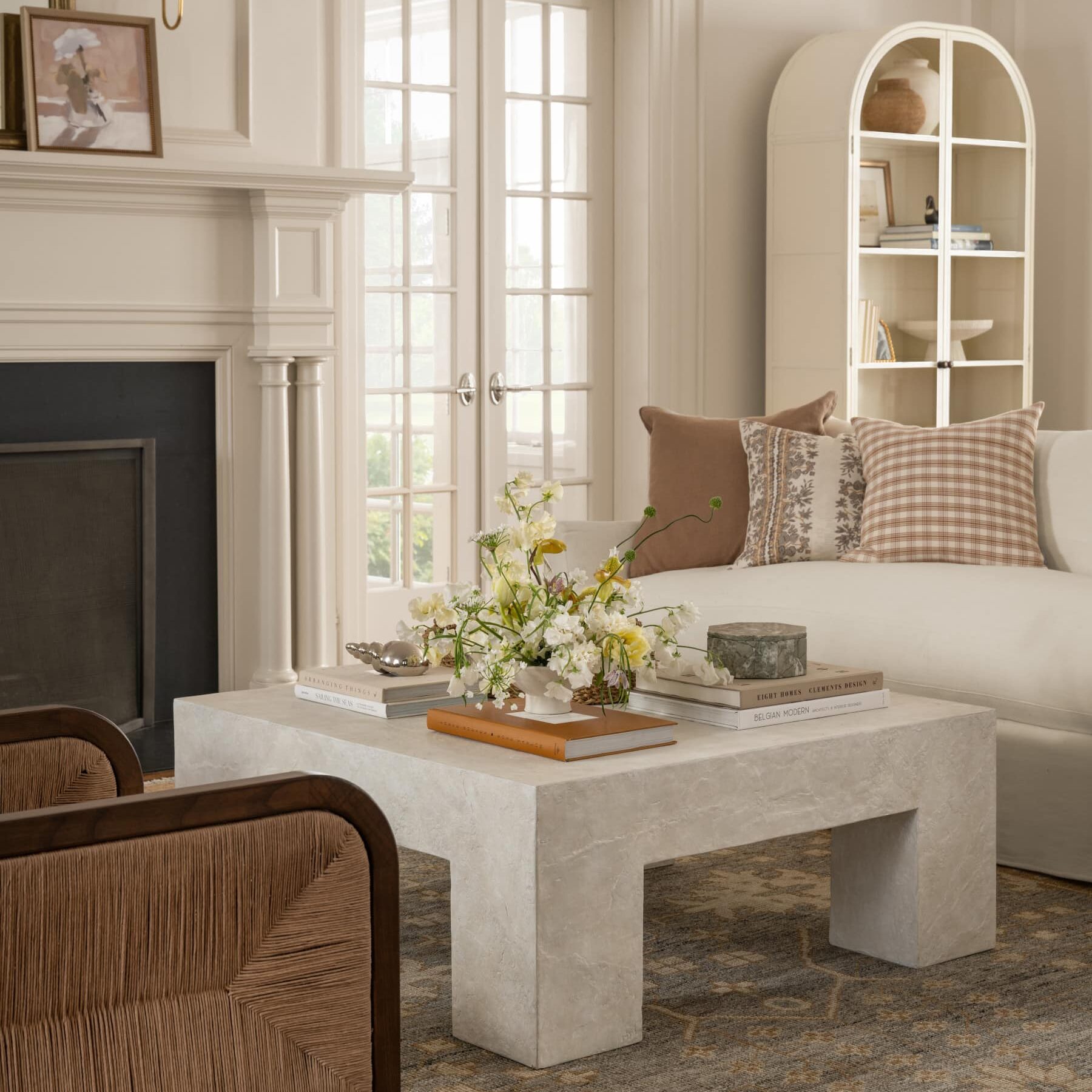
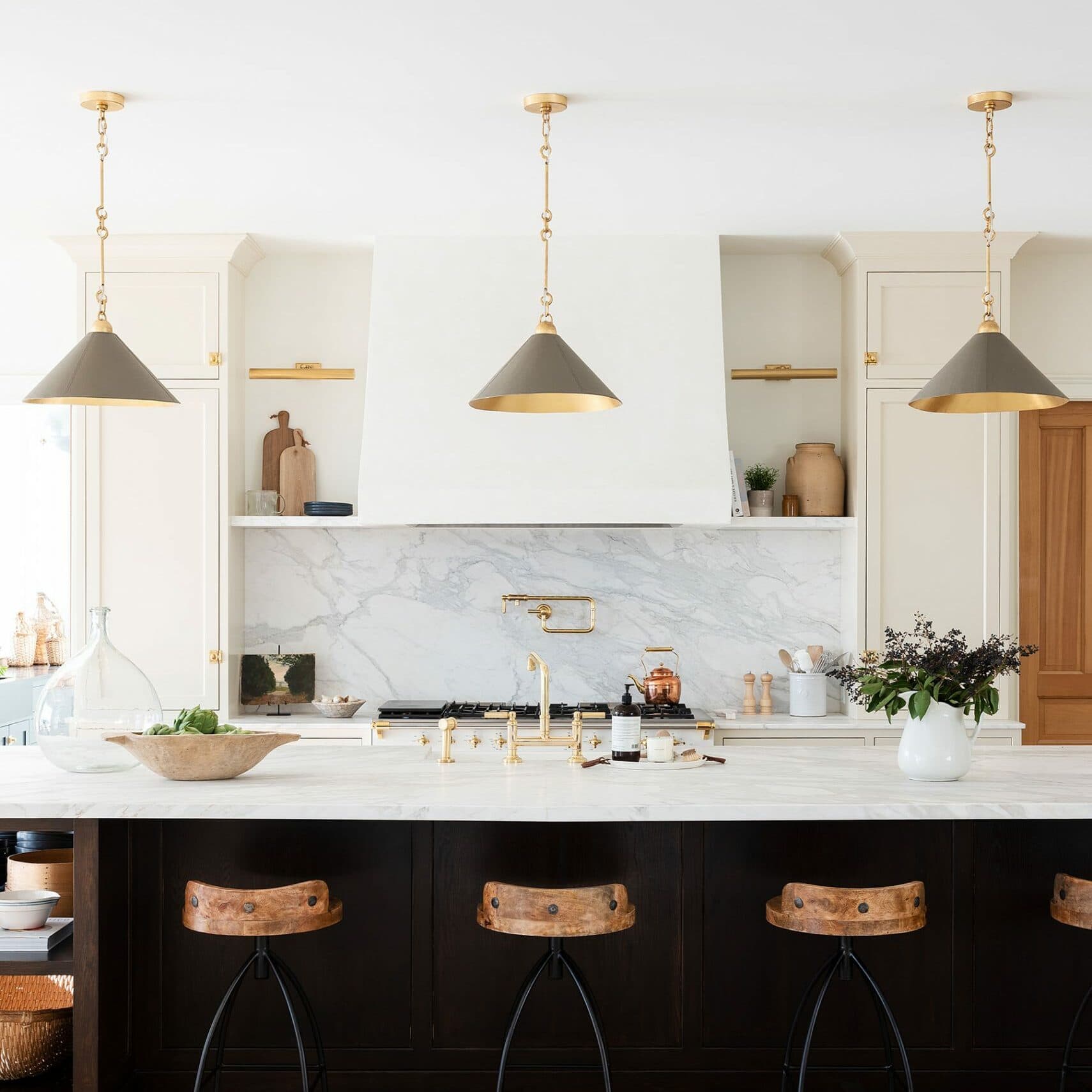
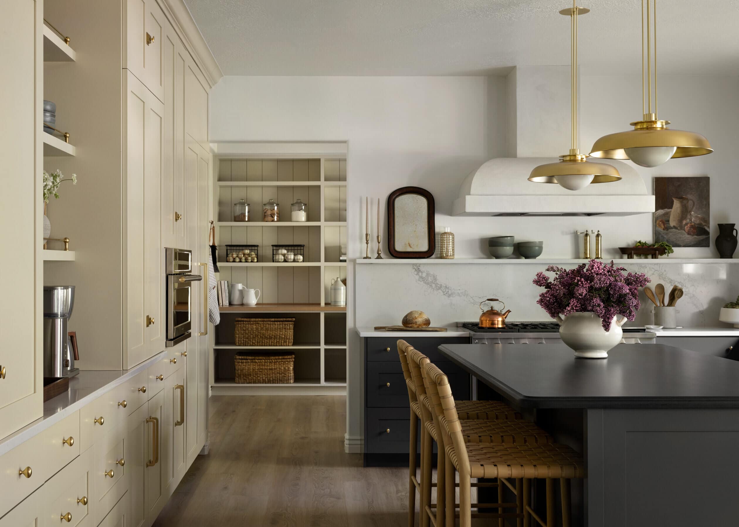
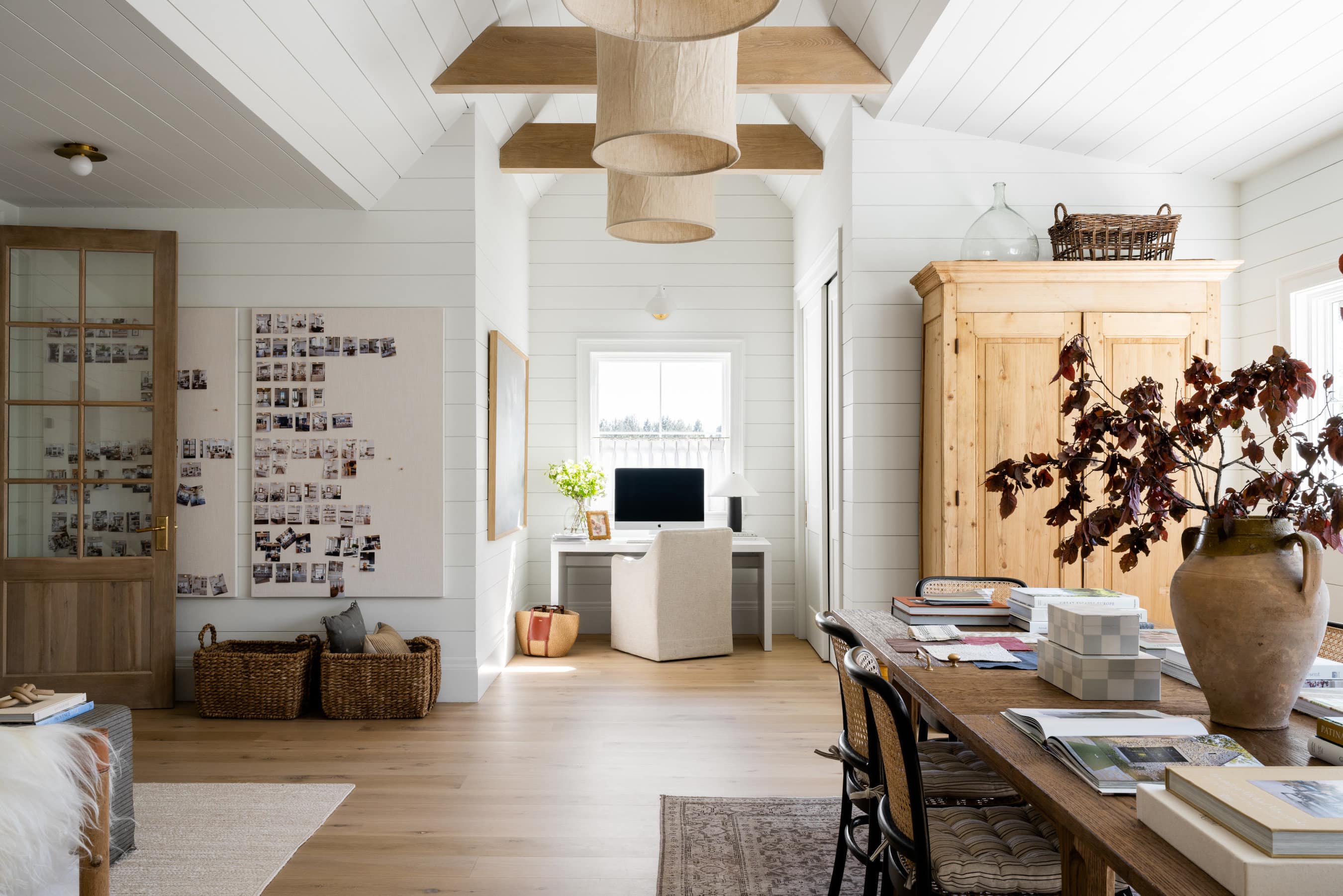
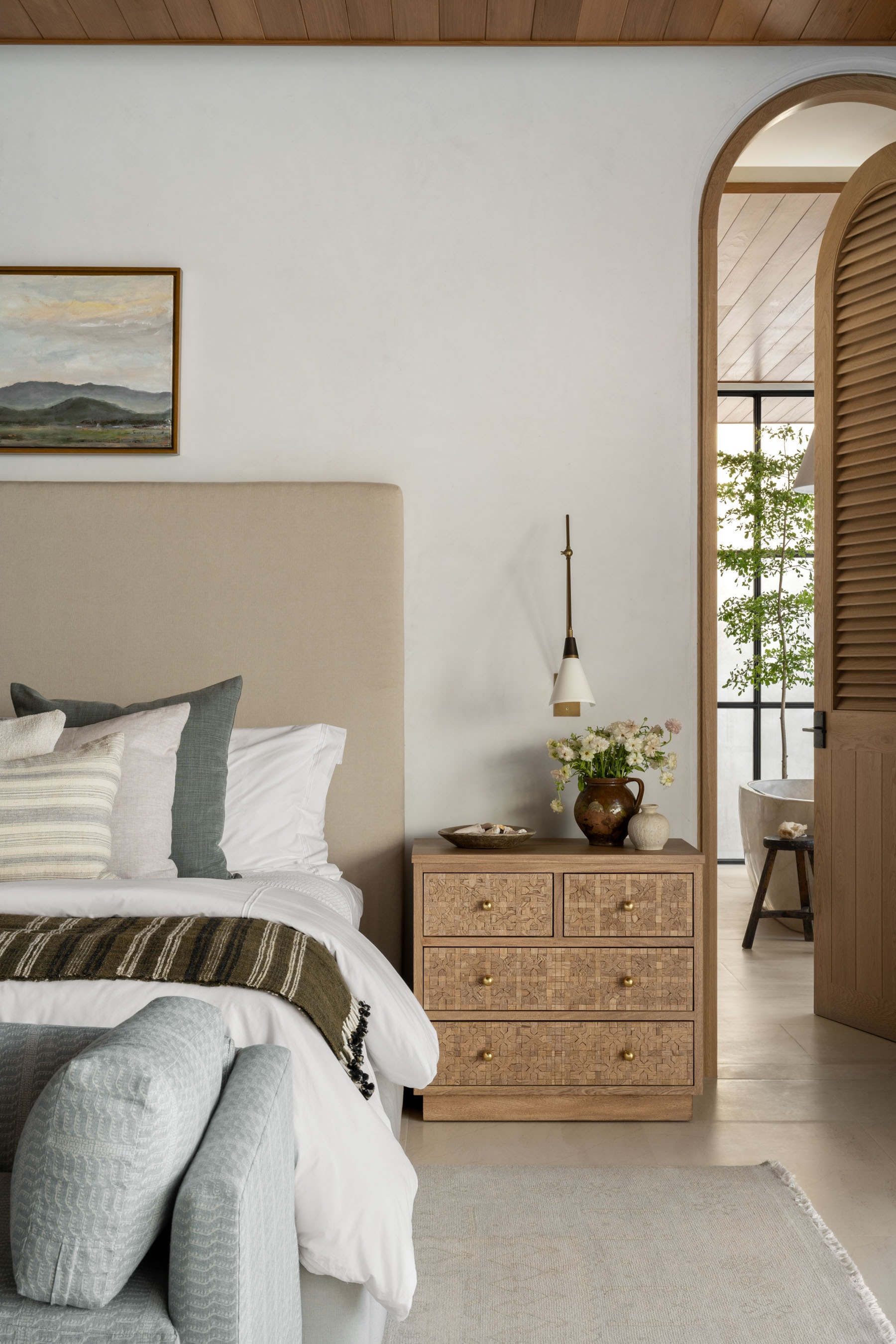
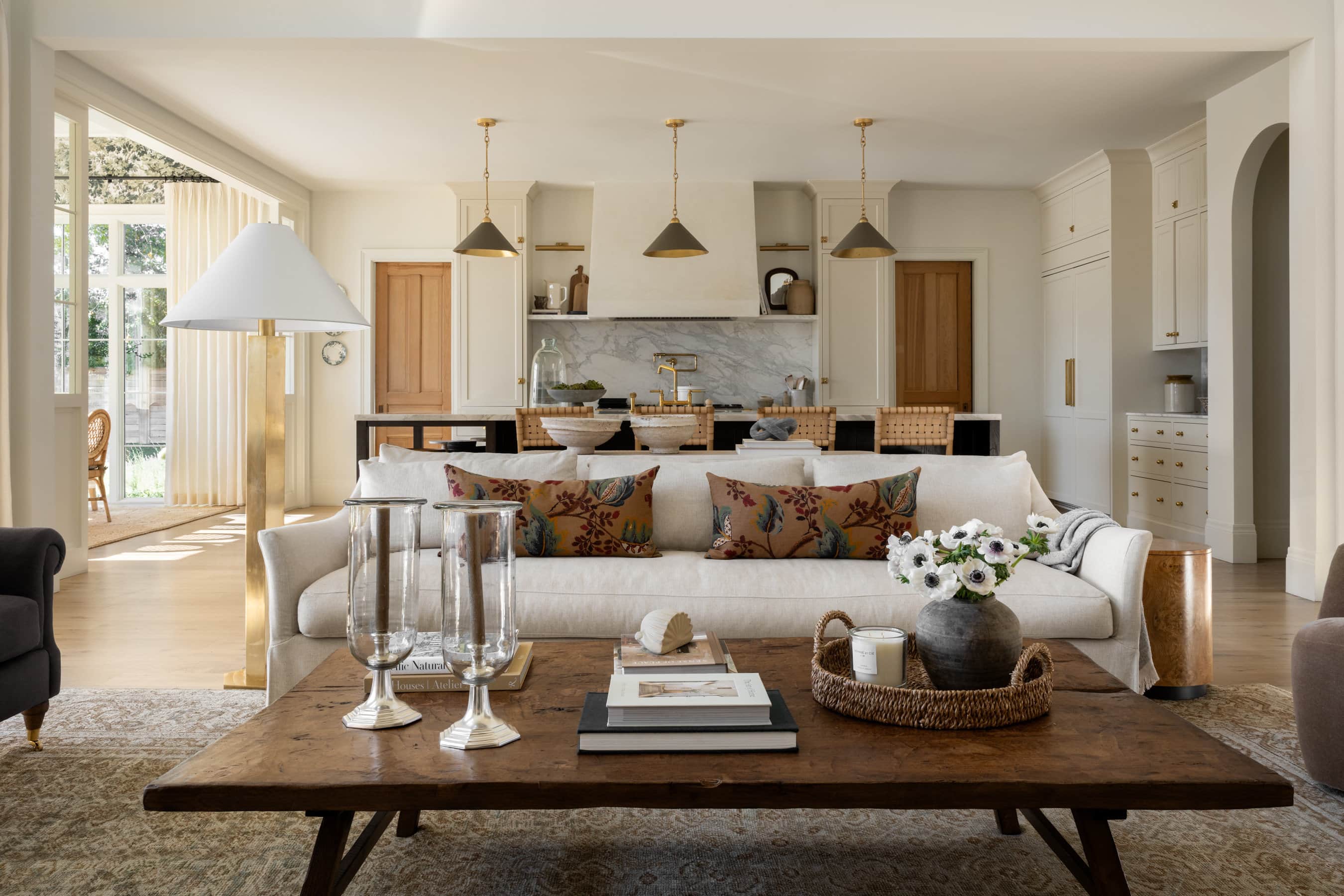
This is one of Shea’s favorite white paint colors, so much so she used it extensively throughout her own home. She chose to have it mixed at 75% strength because it was showing just a little too yellow when tested. It’s a warm, welcoming, and smooth hue, a great option for more traditional spaces and plays well with other creamy tones and golden undertones.
Tour the full McGee Home Refresh project here.

02
White Dove
Grey undertones by Benjamin Moore.
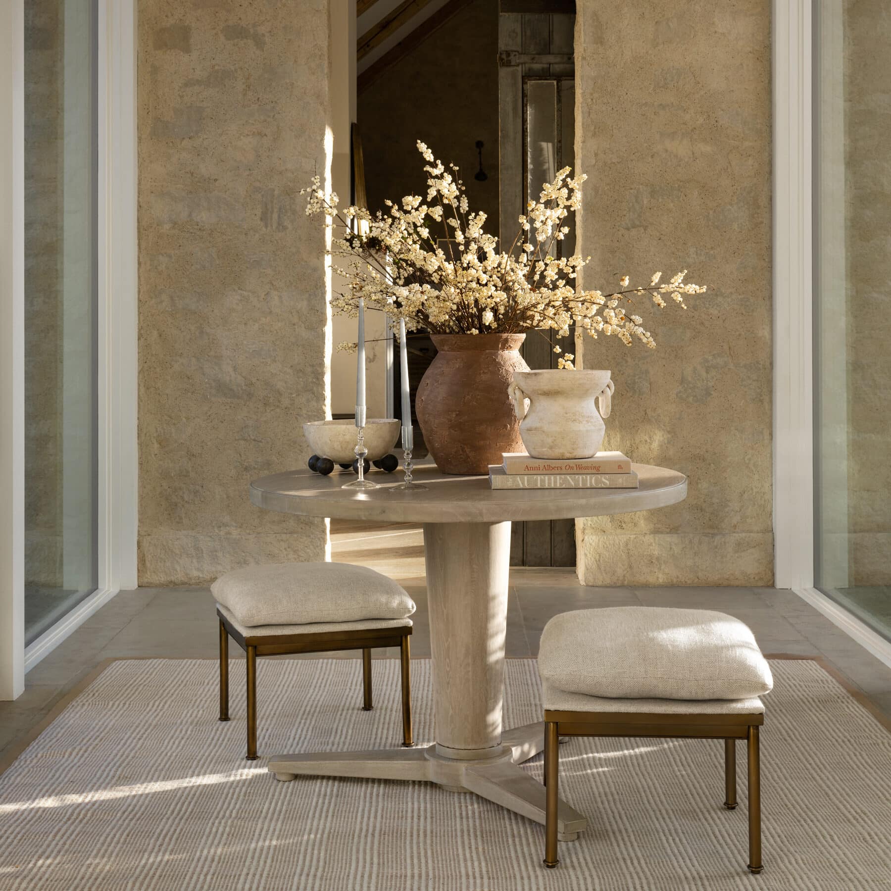
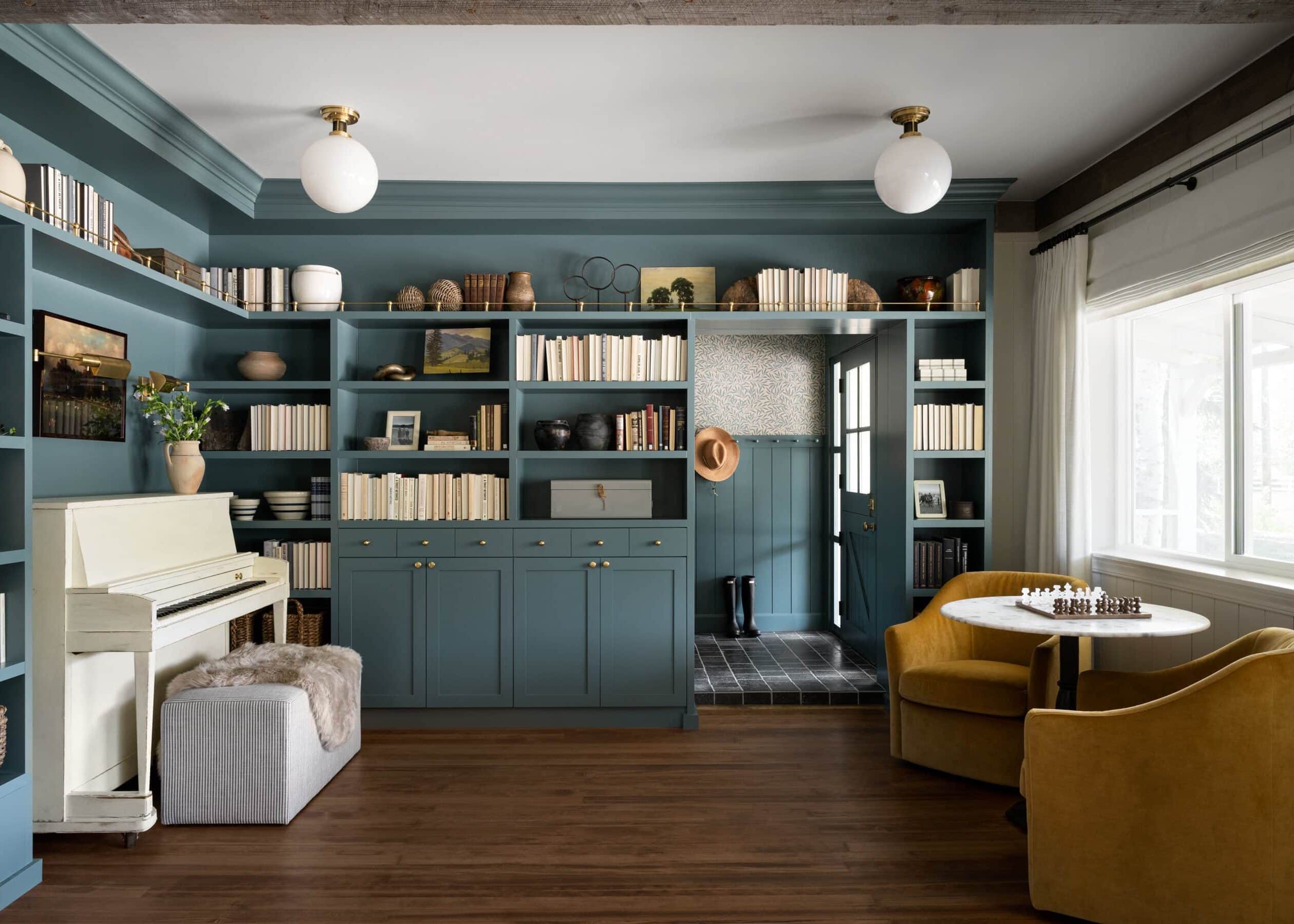
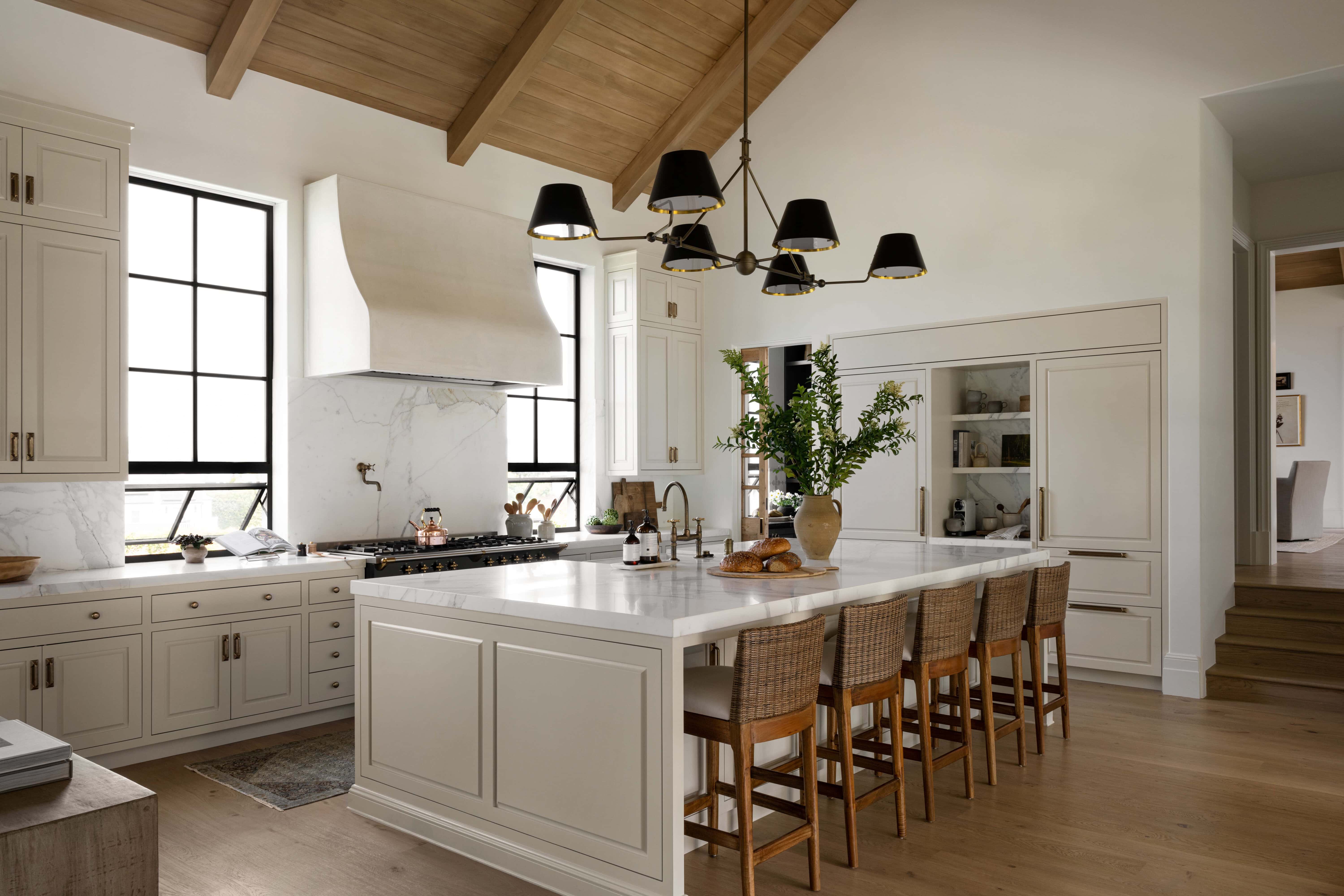
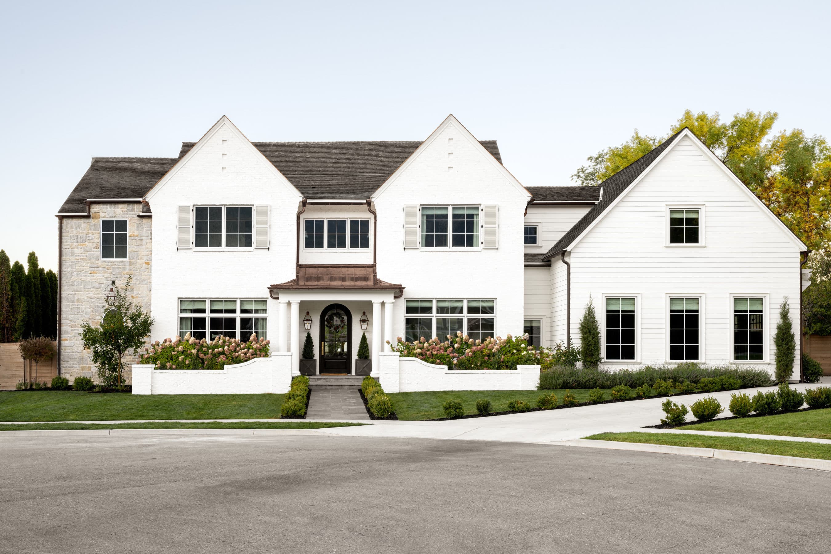
Known for reflecting light beautifully, White Dove by Benjamin Moore is a favorite for its luminescent finish and creamy grey undertones. While not a true white, it still has a soft, calming effect without looking yellow. We love using this shade in spaces with lots of natural light.
You’ll see this shade used in an exterior setting on the McGee’s own home in Salt Lake City, Utah.
Tour the full McGee Home Refresh project here.
03
Cloud White
Soft and balanced by Benjamin Moore.
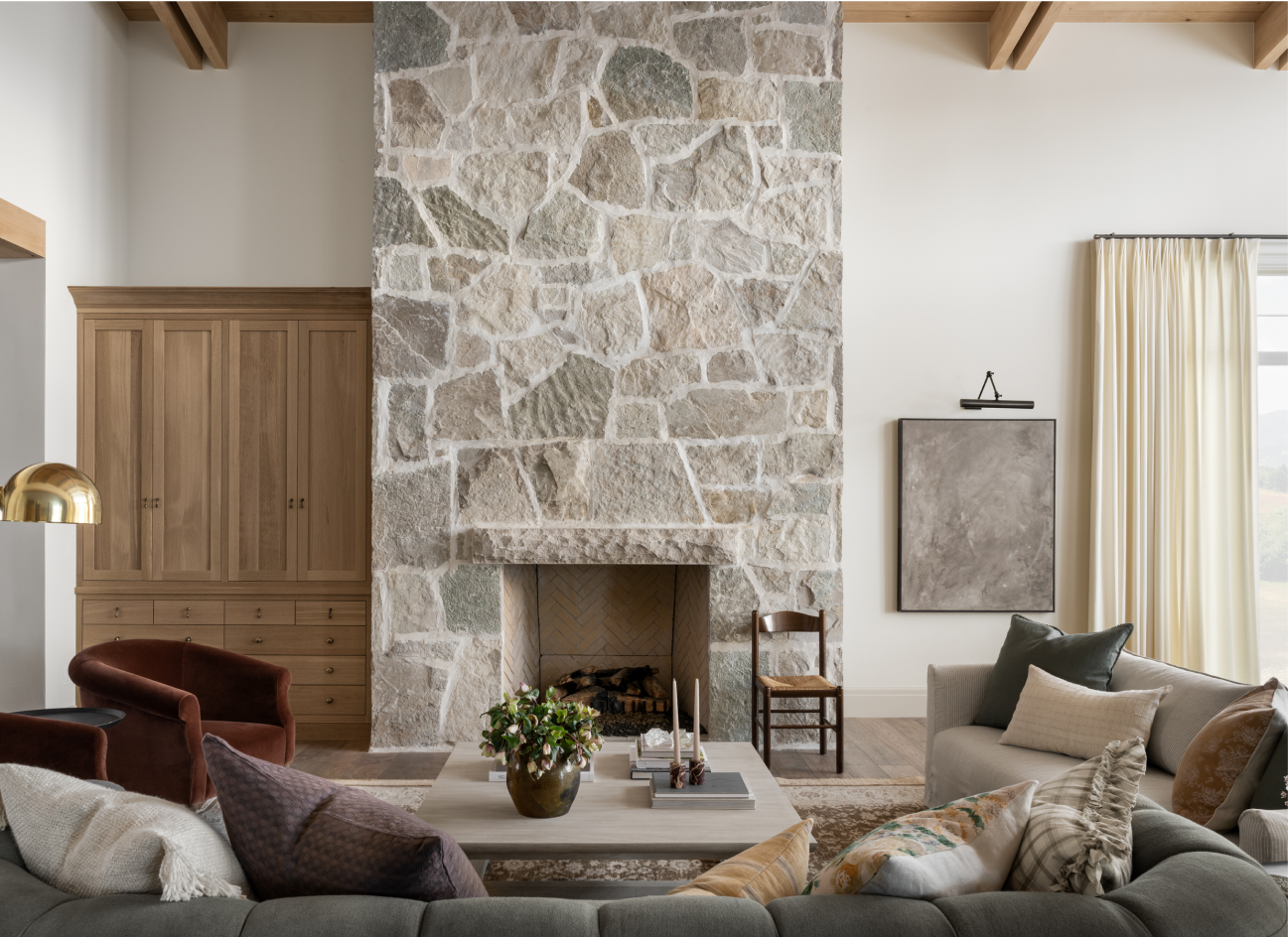
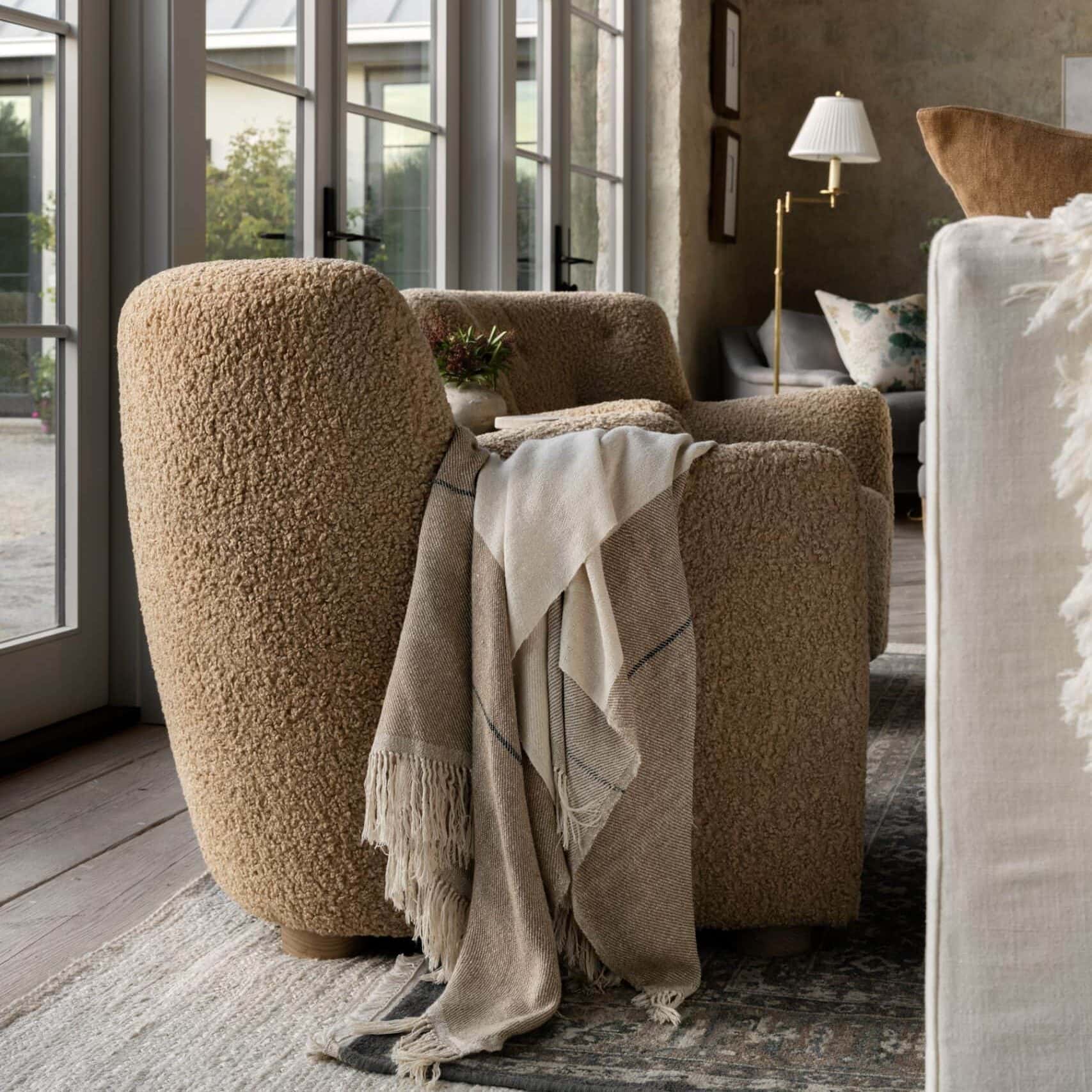
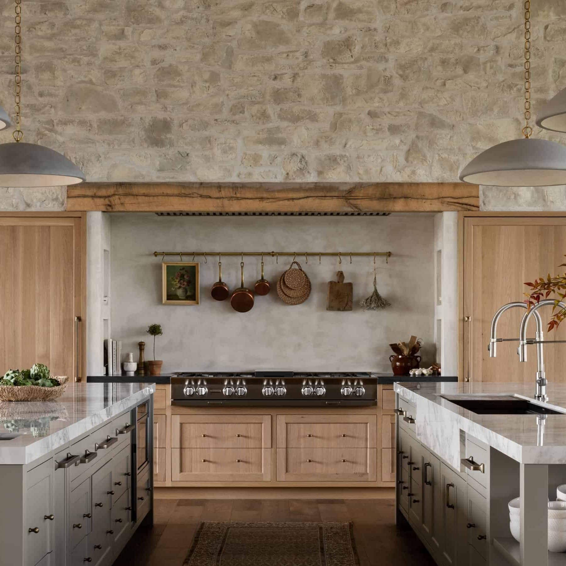
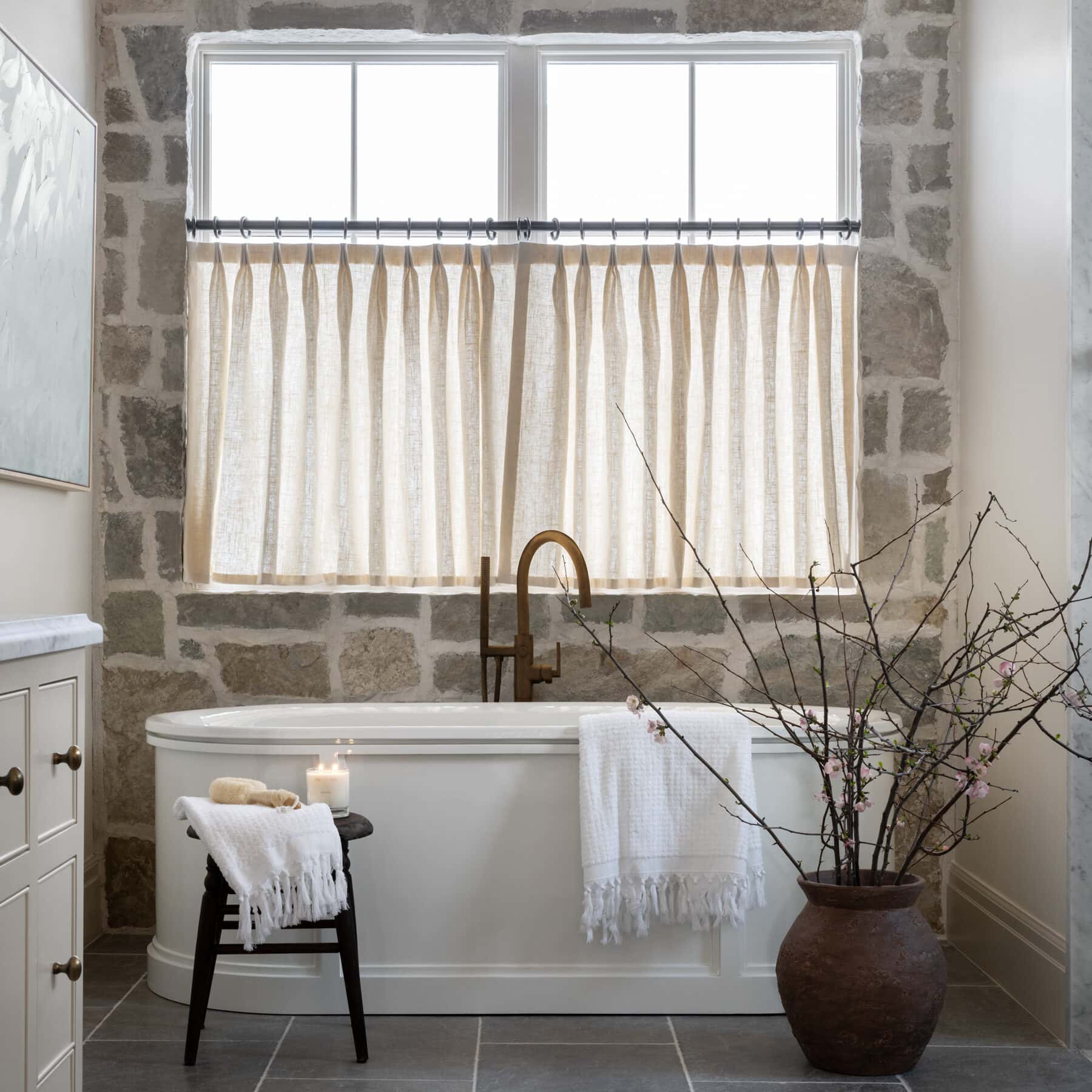
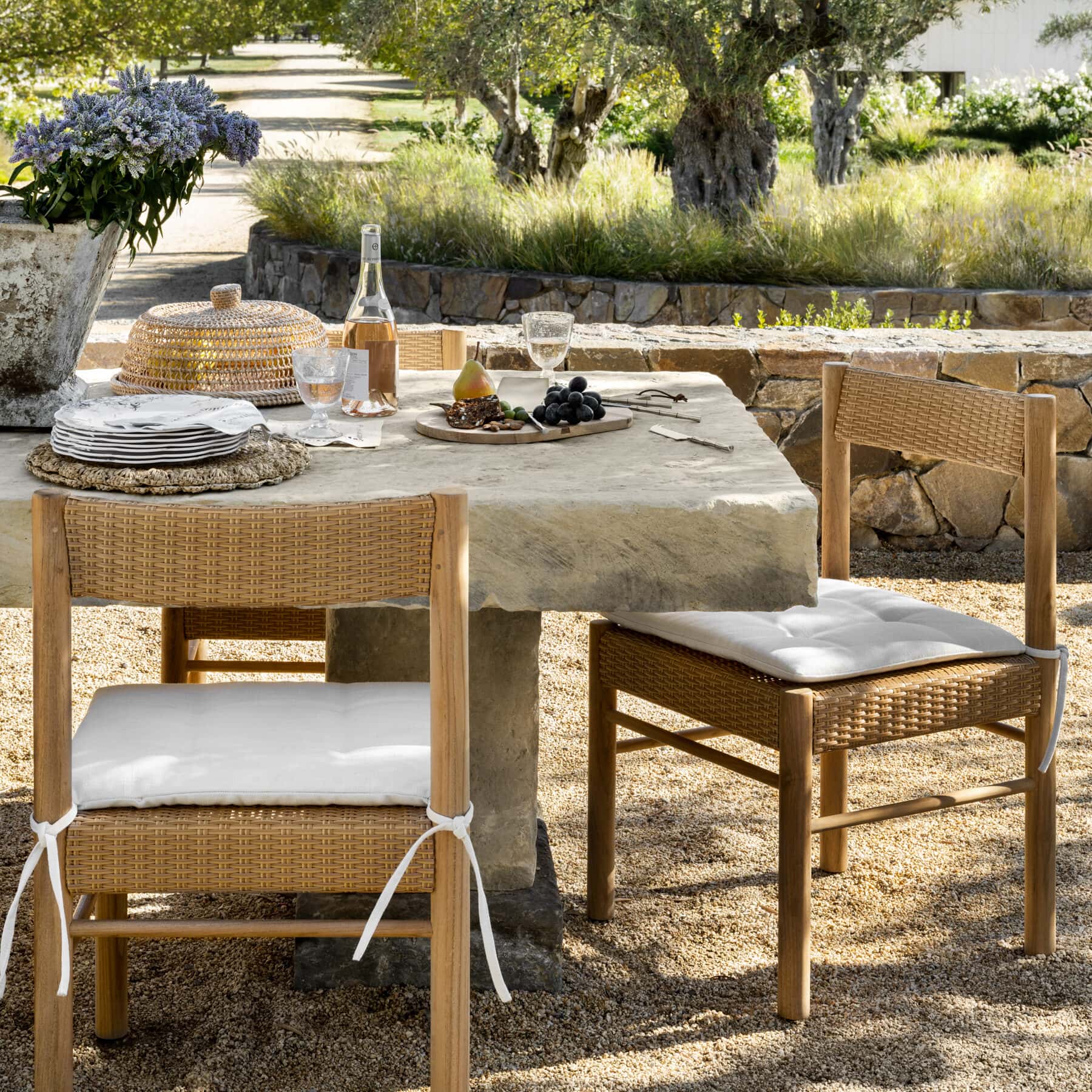
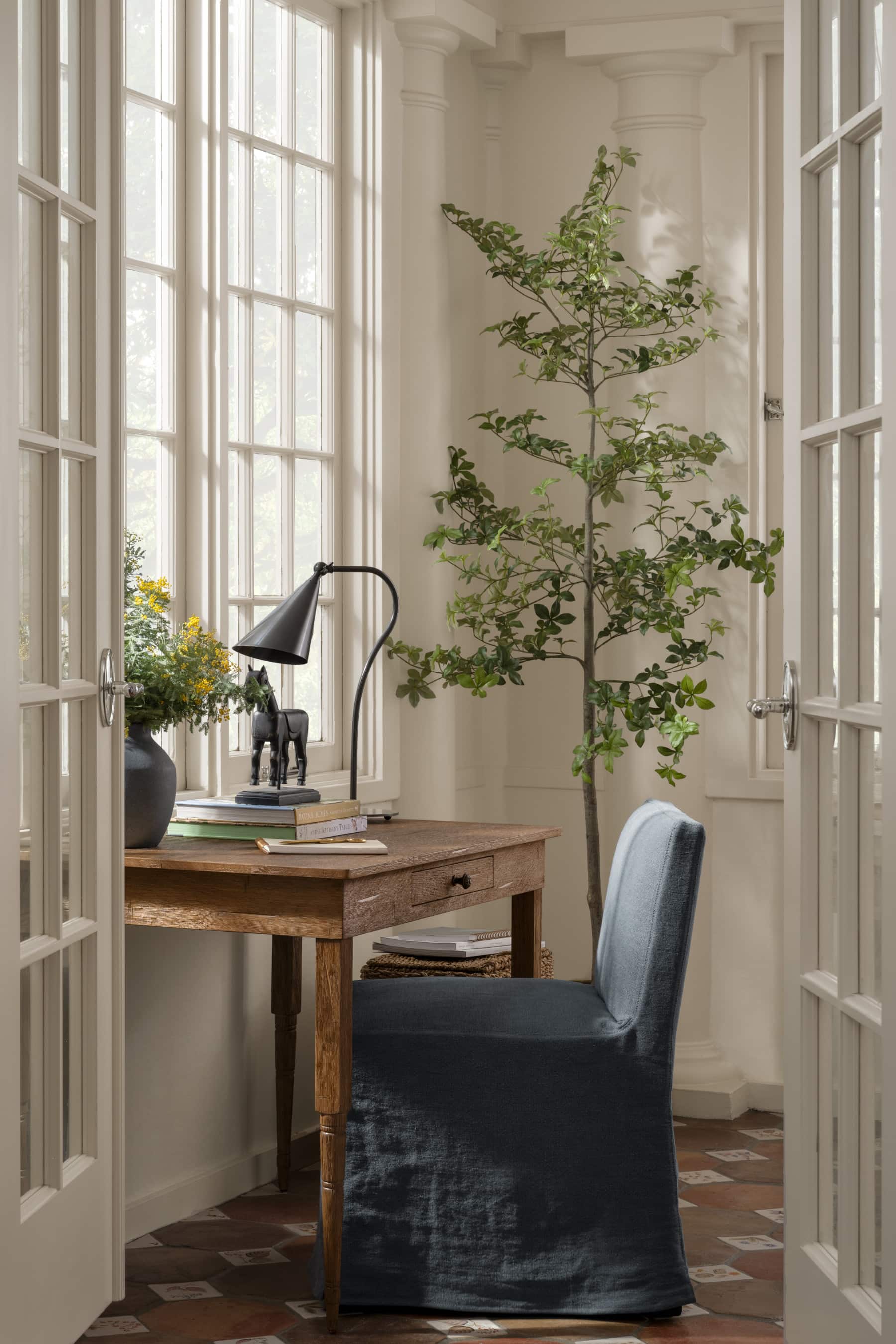
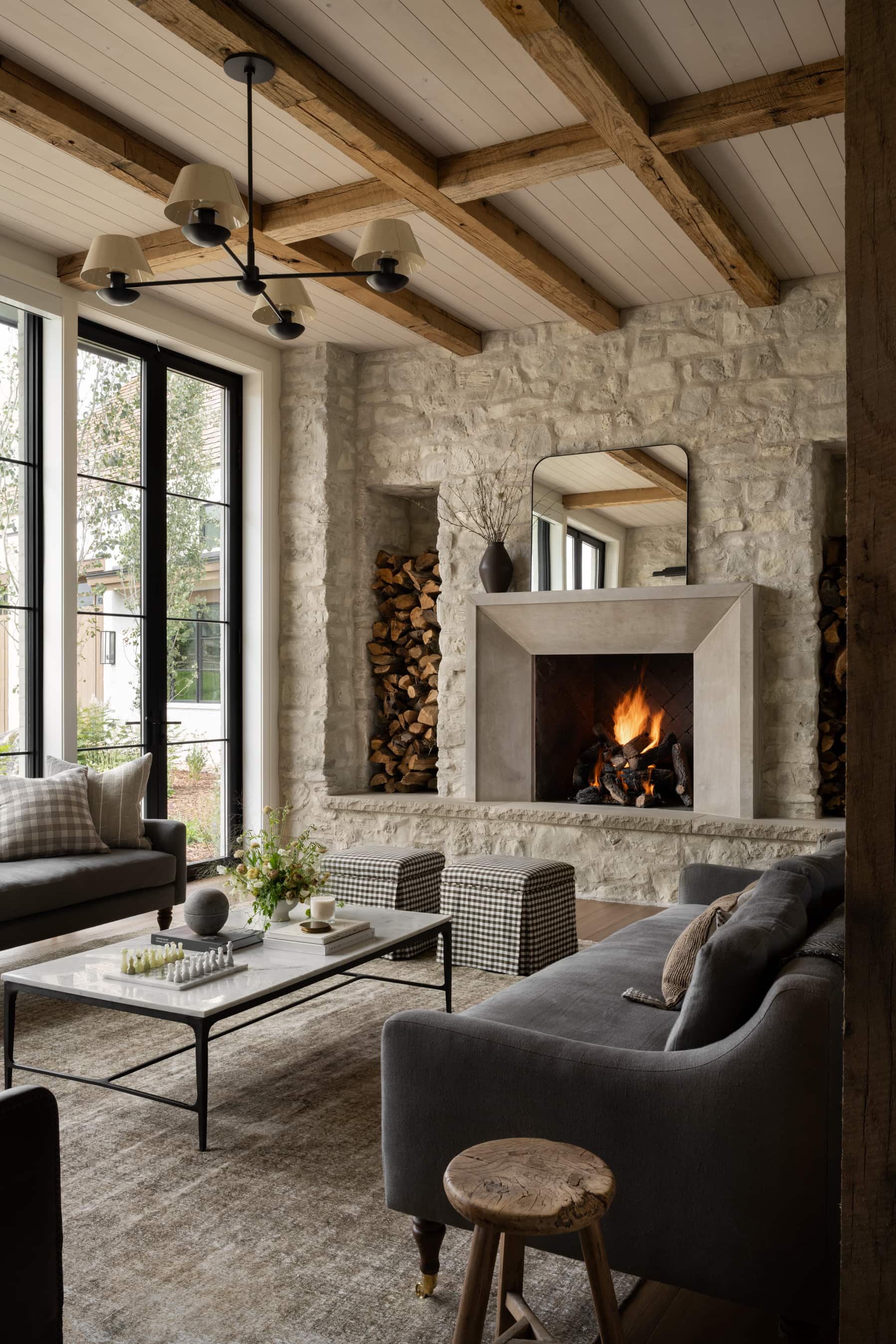
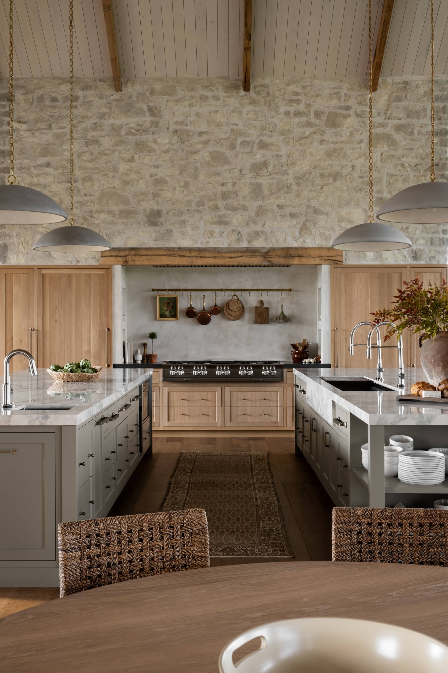
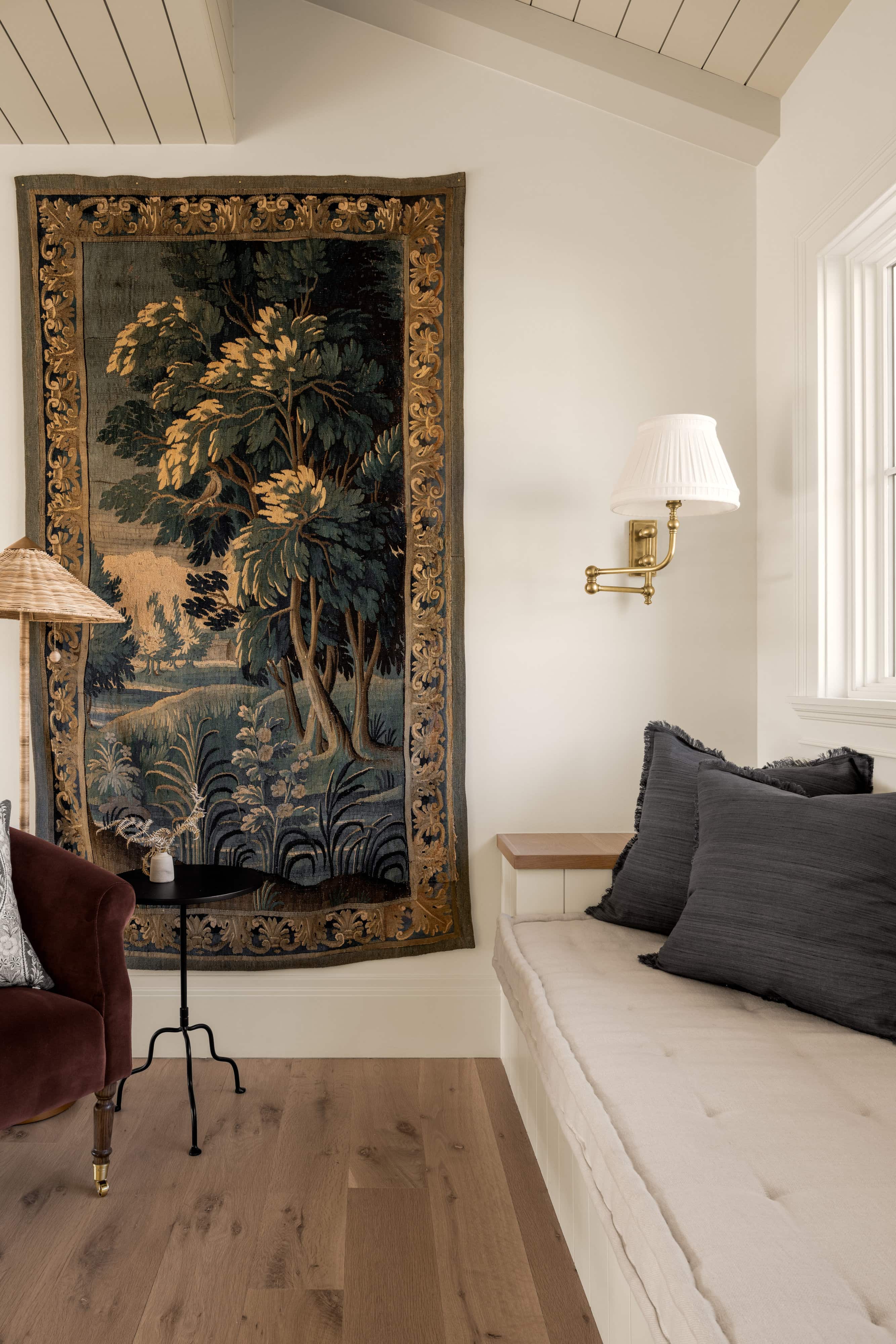
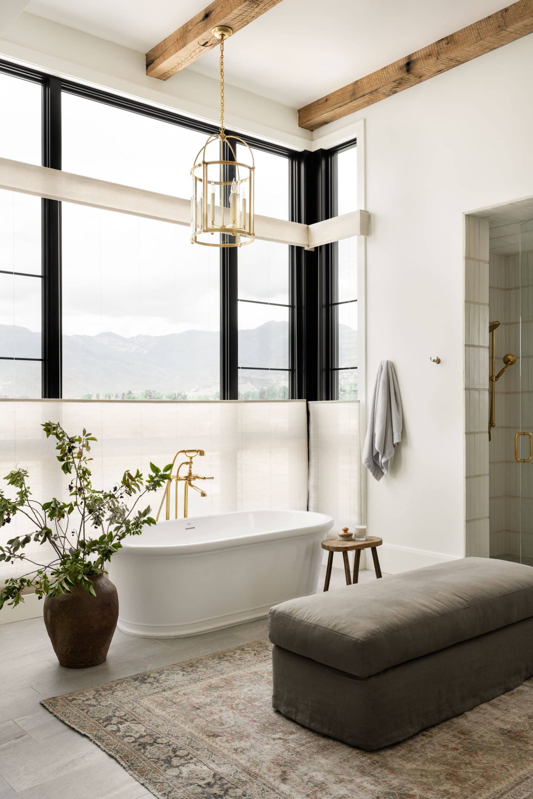
Cloud White is a soft off-white with taupe undertones. It’s great paired with earthy tones of brown and cream and used in a house that has a natural, organic material palette. Cloud White is used extensively in our Water’s Edge project due to its muted color palette and use of exterior stones inside and rough-hewn wood.
Tour the full Water’s Edge project here.


04
Ivory Lace
Cool, pink undertone by Sherwin Williams.
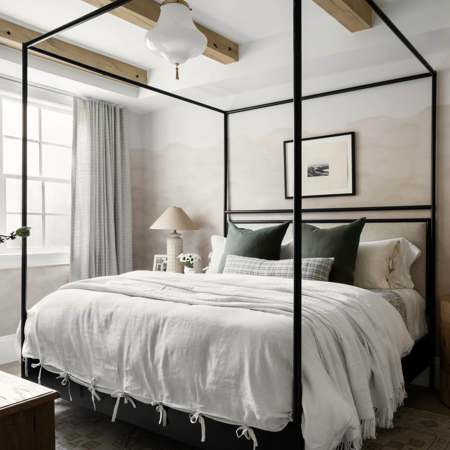
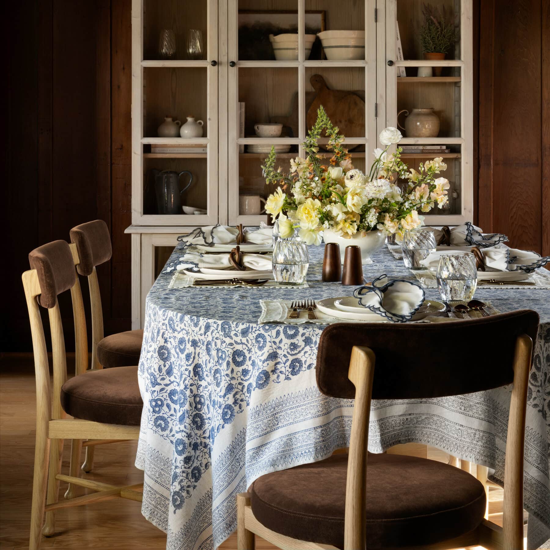
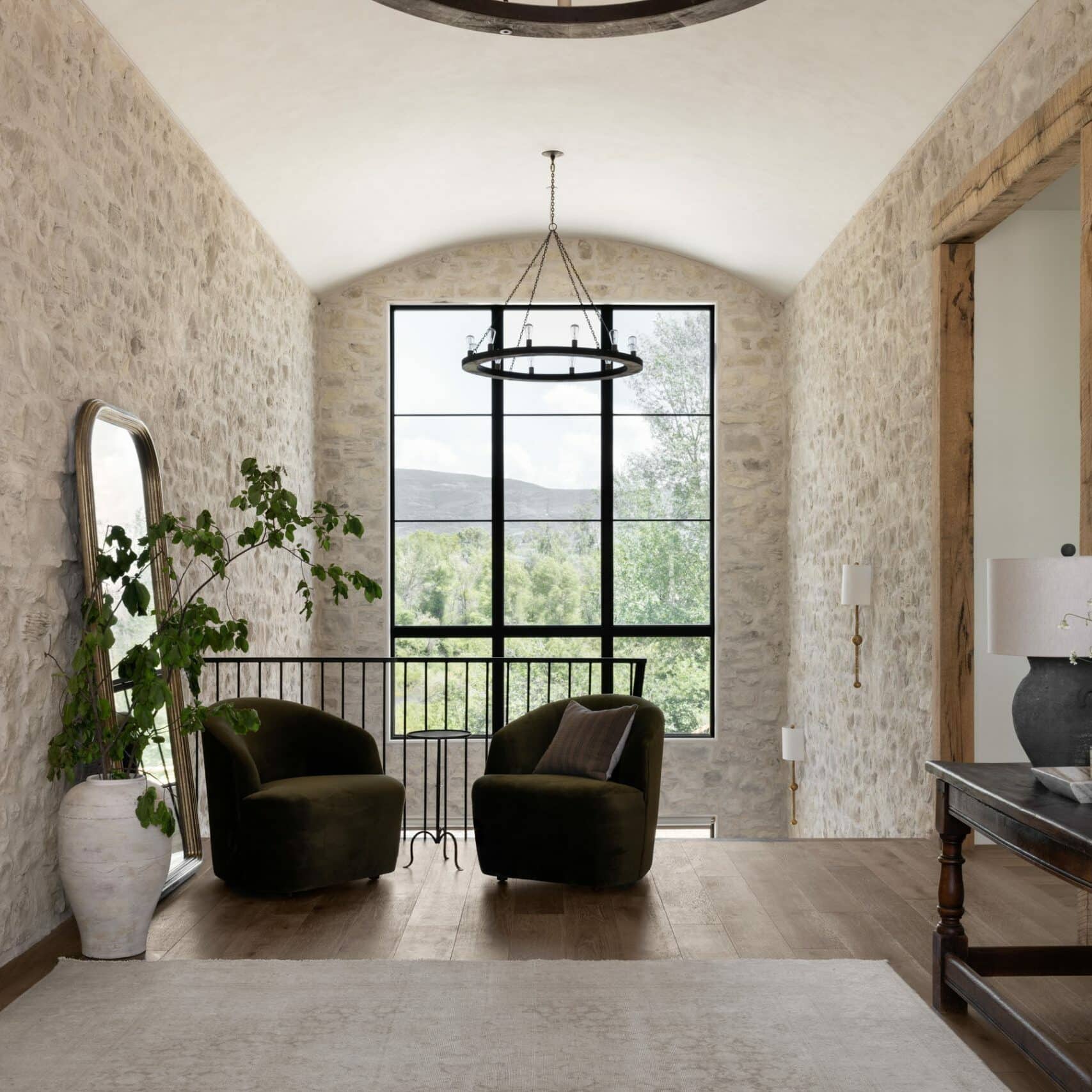
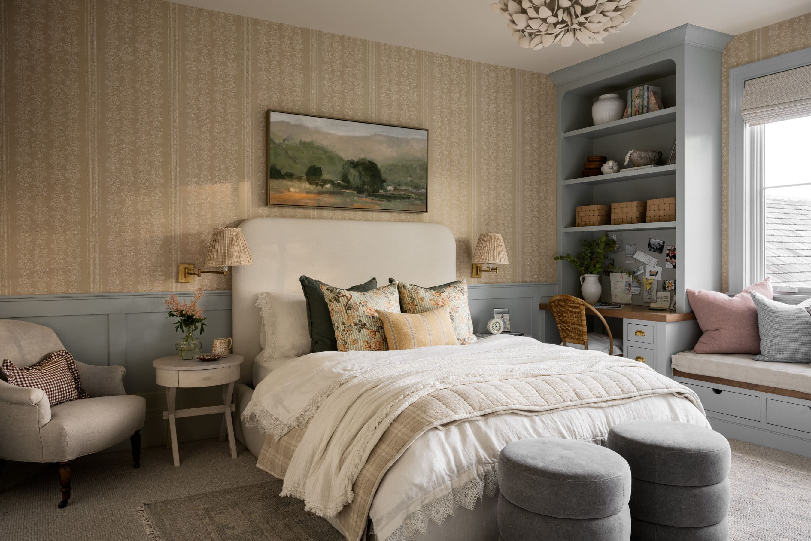
Ivory Lace adds a delicacy to a room. It’s a warm, creamy white that has the slightest tint of pink to it in certain light. Shea and the design team used it in the Spec Home project to add a sense of antiquity to the new build.
Tour the full Spec Home project here.
